Last summer I realised I had fallen out of love with Pebble’s branding and it was starting to have an impact on my business.
Pebble’s original branding was created in 2006, adapted a couple of years later, and again in 2016. But come 2019 I was bored with it and decided it needed to change. My branding was looking dated.
![]()
![]()
I was no longer proud of my branding. The visual aspect of my business was everywhere - emails, invoices, business cards and, of course, my website. Yet, I didn’t like it. And this meant that I was not promoting my business in the way I should have been. It was holding me, and my business, back.
I thought a mini rebrand, a quick fix, would do the trick and decided that I would change the colour scheme. I knew I wanted soft natural colours, and, of course, natural colours work perfectly with Pebble.
Decision made, I contacted Lisa, the Managing Director of Spoken, a local, design company that came highly recommended. I had several conversations with Adam, their designer, and shared photos that I had taken over the years that I loved.
Adam delivered exactly what I asked for. But I didn’t like it. I had assumed that if I liked a logo and a colour then the two would match perfectly. I was wrong. It was back to the drawing board.
I needed more than a change of colour
I spoke with Adam and suggested that my “mini rebrand” was not enough. He completely agreed, he had thought so all along, but had let me come to my own decision.
So, we started again. I followed Spoken’s full branding exercise with him. I revisited Pebble’s business offering, the core values, my objectives, my competitors, the testimonials I had received.
There were some fantastic findings. I still loved the name of my company. My core values remained the same as they were 13 years ago. My ideal clients remained the same too. The business model was working.
I explained that Pebble supported small businesses. “Supporting you in your success” was my strapline. I wanted to demonstrate support somewhere in my logo.
Firstly, Adam shared some mood boards concentrating on colour. I decided instantly that the soft natural colours I was thinking about were out. They weren’t strong enough, perhaps too feminine.
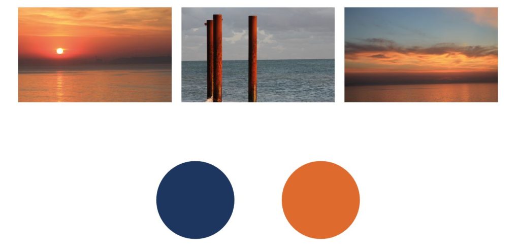
From my photos, Adam picked up on my love of sunsets and the sea. From that, the colour scheme was created. These colours obviously fitted with my original thoughts of nature, but provided the strength and depth I was looking for. The meaning behind the colours he picked were also a perfect fit and matched perfectly with my core brands values.
The colours and core values matched perfectly
Blue is associated with depth and stability. It symbolizes trust, loyalty, wisdom, confidence, intelligence, faith and truth.
Orange represents enthusiasm, fascination, happiness, creativity, determination, attraction, success, encouragement, and stimulation.
What’s more, sunsets and the sea are a natural fit with Pebble.
The colours agreed, it was now time to look at the logo. As I said, I was thinking of a visual that represented support and depth. Again, Adam delivered a mood board of ideas, based on existing logos, all using depth and support. But this time he included a wild card, in his words, “a simple typographic logo using a pebble as part of the lettering”. I loved this idea, so again Adam went and worked his magic. He considered the fact that I wanted to represent support, you can see this in the second and third option below. Again, Adam delivered just this, yet the wild card won again. Option one drew my attention instantly. I loved it.
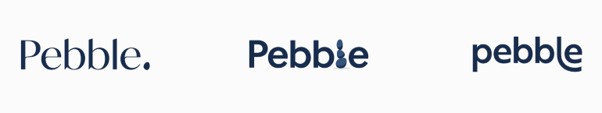
From then it was simple. I loved the simplicity of the logo, adored the font, but I wanted to include some colour. The pebble became orange, and with that, my new logo, and branding, was born.
I am really proud of my brand again. If it wasn’t for this, I am not sure that I would have launched Pebble’s Post, our newsletter and blog. It was an exercise that has really paid off.
Is it time for you to re-brand?
Ask yourself:
- Am I proud of my brand?
- Does my brand represent my business in the way I want it to?
- Is my brand holding me back?
If the answer to any of the above is negative, then perhaps it is time for you to revisit your brand. Our logo and website are often the first impressions our potential clients see of us.
The right branding makes a positive impression and enables customers to understand what to expect from you.
It is key to business success, and an exercise I highly recommend.